- About
- Objective
- Features
- Documentation
- Documentation Builder
- Setup
- Setup Domain
- Page Builder
- BYOS
- LMS
- About LMS
- Creating Courses
- Course Management
- CMS
- Site Features
- Posts
- Media
- Live Customizer
- Workshops
- Zoom Meetings in AcademyLauncher
- Google Meet in Workshops & Google login
- Community
- Community features
- Users
- eCommerce
- Products
- Memberships
- Orders
- Subscriptions
- Payments
- Configuring Stripe
- Payment Settings
- Configuring Razorpay
- Reports
- Dashboard
- Course reports
- Administrator
- Policy
- Privacy Policy
- FAQ
- Default Storage
- Setting up site logo, title
- Customize Dashboard Menu
- Account
- Account workspace overview
- Manage plan, imports, policies, and ownership
- Manage workspace features
- Manage domains, URLs, and sitemap
- Manage data and privacy requests
- Configure role navigation
- Configure dashboard layout
Button
Button element is a basic element in building any web page. The primary purpose of this button is to act as a link to another page.
This is highly useful in creating Call to Action points on any page.
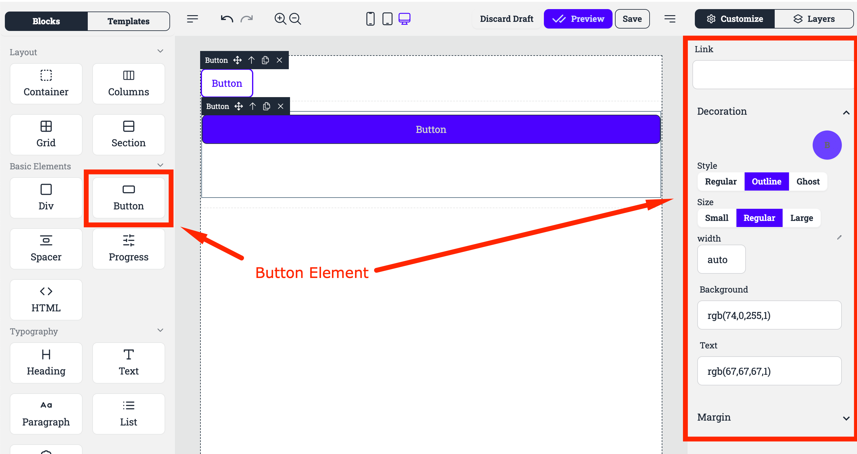
Link : The Link to the page the button should direct to.
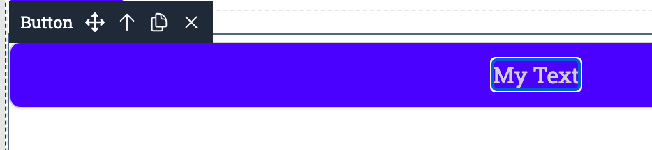 : To edit the buton Anchor text, simply double click on the Text “Button” and you can edit the text.
Style: This section provides options for customizing the appearance of the button, including:
Regular: The default button style.
Outline: Creates a button with an outline instead of a solid background.
Ghost: Creates a transparent button with only a subtle outline.
Size: This section allows users to adjust the size of the button, including:
Small: A smaller button size.
Regular: The default button size.
Large: A larger button size.
Width: This setting controls the width of the button. Default width is set to auto, you can remove the auto and use the edit icon to use the slider control to adjust the width of the Button.
Background: This section allows users to customize the background color of the button.
Text: This section allows users to customize the text color of the button.
Margin: This section allows users to adjust the spacing around the button.