- About
- Objective
- Features
- Documentation
- Documentation Builder
- Setup
- Setup Domain
- Page Builder
- BYOS
- LMS
- About LMS
- Creating Courses
- Course Management
- CMS
- Site Features
- Posts
- Media
- Live Customizer
- Workshops
- Zoom Meetings in AcademyLauncher
- Google Meet in Workshops & Google login
- Community
- Community features
- Users
- eCommerce
- Products
- Memberships
- Orders
- Subscriptions
- Payments
- Configuring Stripe
- Payment Settings
- Configuring Razorpay
- Reports
- Dashboard
- Course reports
- Administrator
- Policy
- Privacy Policy
- FAQ
- Default Storage
- Setting up site logo, title
- Customize Dashboard Menu
- Account
- Account workspace overview
- Manage plan, imports, policies, and ownership
- Manage workspace features
- Manage domains, URLs, and sitemap
- Manage data and privacy requests
- Configure role navigation
- Configure dashboard layout
Columns
This feature enables the creation of multi-column layouts, allowing users to organize content across multiple vertical sections.
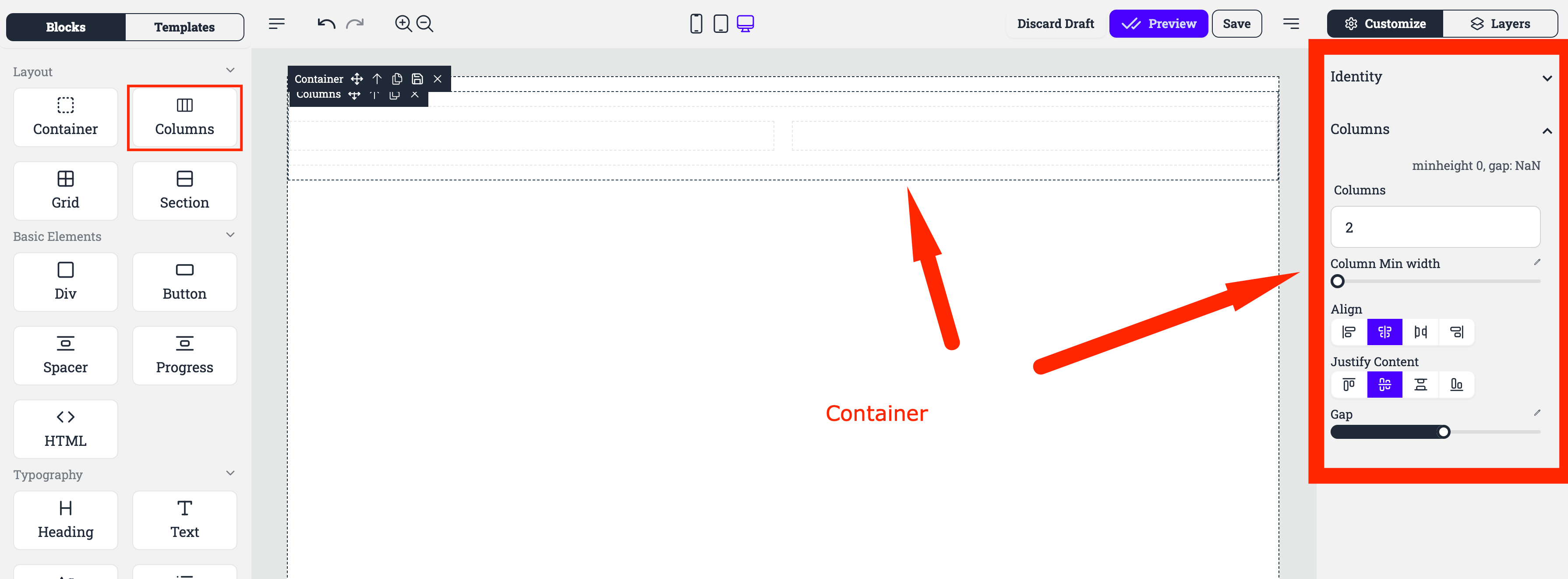
Columns : Here you define the number of columns you want to show in the layout.
Min Height: This option allows users to define the minimum height for each column, ensuring that columns maintain a consistent size and do not shrink beyond a specified limit.
Gap: This control adjusts the spacing between columns, offering flexibility in defining the visual separation between them.
Columns Min Width: This setting allows users to establish a minimum width for each column, ensuring that they do not become too narrow, particularly in responsive designs.
Align: This setting provides options for aligning content within each column, such as aligning it to the left, right, or center, ensuring precise control over content placement.
Justify Content: This option allows for even distribution of content within each column, similar to the "justify-content" property in CSS, offering control over how content is spaced and arranged within the available column space.
Within columns each element is a Column Layout.
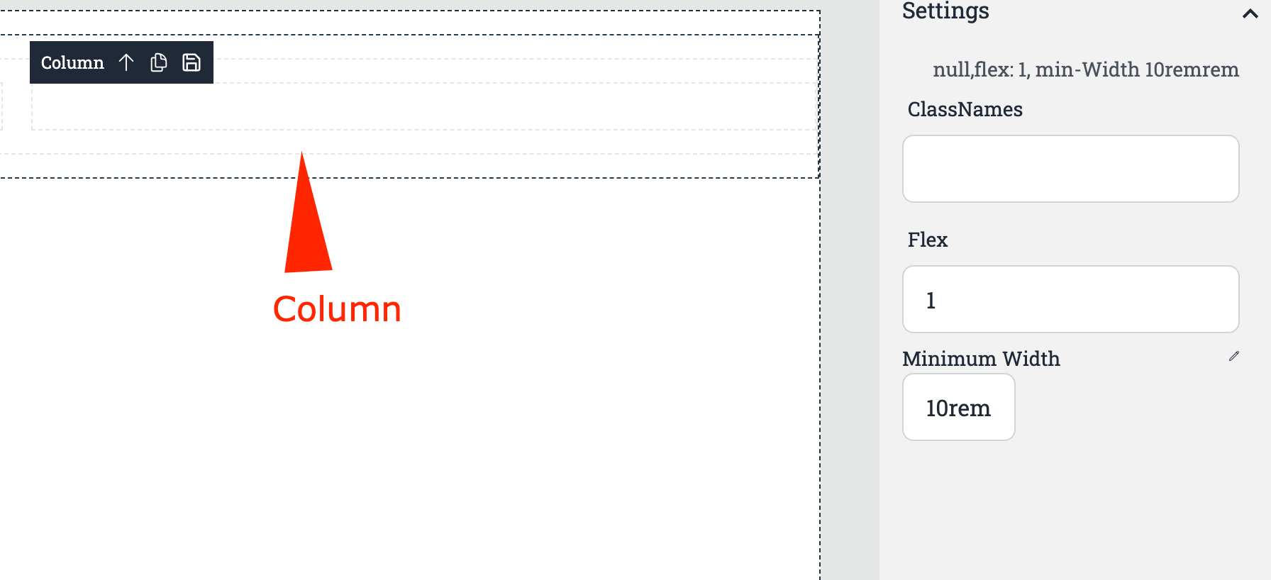
The Flex property allows you to specify the amount of space the column will take.
For example :
2 Columns : 1st Column with 2 Flex and 2nd column with 1 Flex.  The result, first column takes twice as size as the first one.
The minimum Width property allows you to set when the column will wrap below each other.
For example :
Window size : 20 rem
Each column size : 10rem
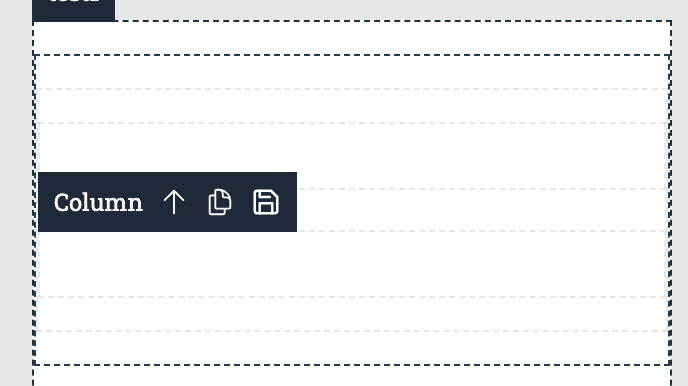 The result, column wrap one over each other as there is not enough space to accomodate each blocks minimum width.