- About
- Objective
- Features
- Documentation
- Documentation Builder
- Setup
- Setup Domain
- Page Builder
- BYOS
- LMS
- About LMS
- Creating Courses
- Course Management
- CMS
- Site Features
- Posts
- Media
- Live Customizer
- Workshops
- Zoom Meetings in AcademyLauncher
- Google Meet in Workshops & Google login
- Community
- Community features
- Users
- eCommerce
- Products
- Memberships
- Orders
- Subscriptions
- Payments
- Configuring Stripe
- Payment Settings
- Configuring Razorpay
- Reports
- Dashboard
- Course reports
- Administrator
- Policy
- Privacy Policy
- FAQ
- Default Storage
- Setting up site logo, title
- Customize Dashboard Menu
- Account
- Account workspace overview
- Manage plan, imports, policies, and ownership
- Manage workspace features
- Manage domains, URLs, and sitemap
- Manage data and privacy requests
- Configure role navigation
- Configure dashboard layout
Div Element
The Div element under the Basic Elements is the most versatile element of the PageBuilder blocks. It is the basic building block of the page builder. It has the complete set of CSS properties.
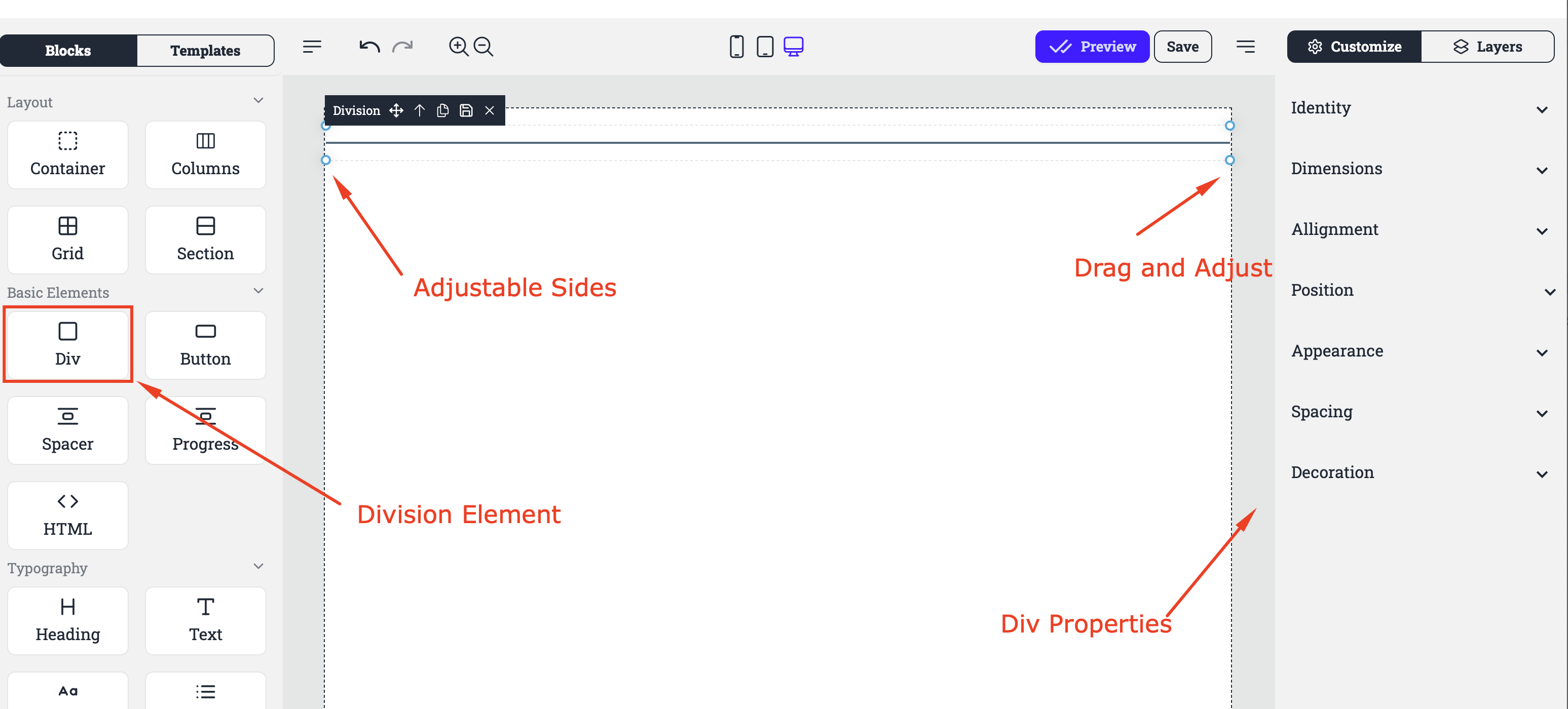
Functionality:
Identity: This section likely allows users to assign a unique identifier or name to the division for reference or styling purposes.
Dimensions: Controls for adjusting the size of the division, including width and height.
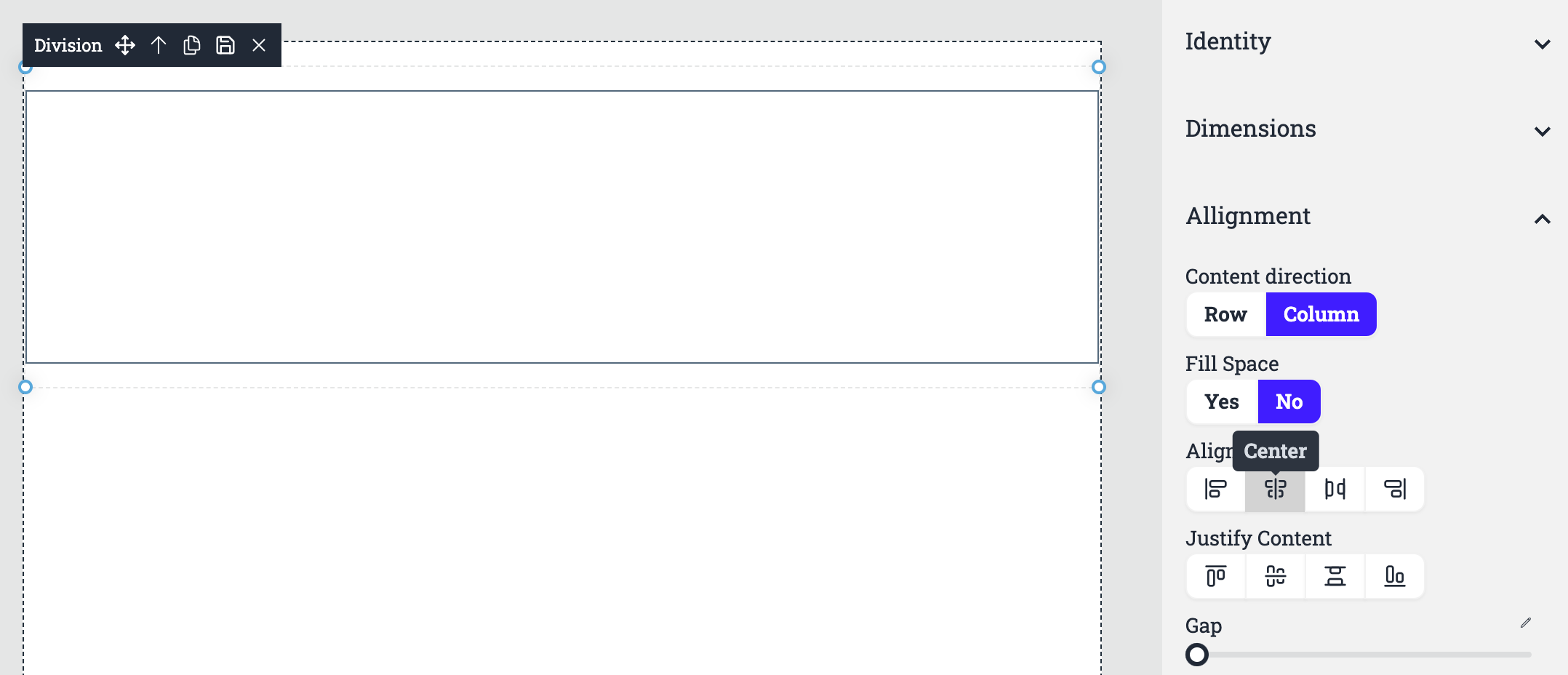
Alignment :
Content Direction: Determines the flow of content within the division, typically either horizontally (row) or vertically (column).
Fill Space: Indicates whether the division should expand to fill the available space within its parent container.
Align Center: Centers the content within the division horizontally or vertically.
Justify Content: Distributes the content within the division evenly, often used for aligning text or other elements.
Gap: Sets the spacing between elements within the division.
Position:
Relative: The element is positioned relative to its normal position.
Absolute: The element is positioned relative to its nearest positioned ancestor.
Fixed: The element is positioned relative to the viewport, meaning it stays in place even when the page is scrolled.
Sticky: The element is positioned relative to the viewport until it reaches a certain scroll position, at which point it becomes fixed.
Appearance
Background: This field allows users to set the background color of the object. The default value is
rgb(255,255,255,0), which represents a transparent background.Color: This field allows users to set the foreground color of the object, such as the text color or fill color. The default value is
rgb(0,0,0,1), which represents a solid black color.Border width: This field allows users to set the width of the object's border. The default value is empty, indicating no border.
Border color: This field allows users to set the color of the object's border. The default value is
rgb(255,255,255,0), which represents a transparent border.
Spacing
Padding: This section allows users to adjust the space between the content of an object and its border. It includes four sliders for controlling the padding on the top, right, bottom, and left sides.
Margin: This section allows users to adjust the space between the object and other elements on the page. It includes four sliders for controlling the margin on the top, right, bottom, and left sides.
Decoration
Radius: This slider allows users to adjust the border radius of the object, creating rounded corners.
Shadow: This slider allows users to add a shadow effect to the object, providing depth and dimension.
Usage:
The division element is commonly used to group related content or create a specific layout within a web page or application. By adjusting the various settings, users can customize the appearance and behavior of the division to fit their design needs.